


Client: Sirens Media | Title Style Frames
Design: Rob Segaar and Michael Strawther
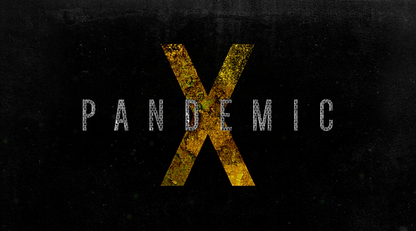
Since the show was still in pre-production we didn't have any dailies to access when Michael and I began working out how we wanted to execute this title. We began by narrowing down our font options to 3. From there we created boards utilizing different weights and placement. I think it was Michael that made the X super big which gave us our first aha moment. Earlier in our research we put aside some iconography that could be useful later in the process and now that we were looking at this large X it both knew we wanted to figure out how to morph the icon into the X. We felt this transformation along with the growing decay played a proper destructive role in pushing the sequence to its climax.
PANDEMIC-X